Hot life is a mobile application designed to help people with at-home fitness training.
This app was created to target GCC area non-gym goers transition into active fitness enthusiasts and help achieve a healthier life for everyone.
☐ Design an online fitness platform
☐ Scalable and integrate with smart devices
☐ Test and adjust based on user feedback to improve user engagement and subscription retention.
✓ Surpassed every goal set
✓ Achieved IOS & Android stores “Fitness” category top 3 grossing apps in Kuwait
• Product Designer: Amirhossein Shamlou
• Android: Sadegh Saati, Arash Azizi
• IOS: Hamidreza Vakilian, Mahan Mirshafa
• CEO: Nezar Al Saleh
• Company: Nizek.com, Ahotlife.com
- Multi-country collaborative effort
A Hot Life is a Kuwait based company started by a tech company with a background in gyms and fitness training. In 2019, I started to work on the app as the sole designer alongside 1 backend, 2 android, 2 ios devs, and the CEO. - Executed end to end
Applying design sprints to set-in-stone deadlines and shipping features and iterating on them live demonstrated our ability to be on top of our game constantly and design around our technical difficulties. - Top #1-3 grossing apps in both IOS and Android store (Kuwait)
Thanks to our amazing team we managed to ship a very successful product. Not only achieving top ranks, but also becoming the featured app of the day for the IOS store.
I had the blessing of having a gym owner that could help me identify their target audience. Thanks to their data, benchmarks, and rival businesses that I looked into, I came up with Fictional Personas based on the Engaging Personas & Narrative Scenarios by Lene Nielsen.
Their persona cards helped shape my thoughts into a cohesive scenario while coming up with user stories and my customer journey sessions with the team.
I used three different personas, differing from a housewife to a fitness enthusiast and shaped our flow by cross-referencing their needs and emotions with an affinity map.
Preparing a clear vision of how the customer would get to know us and interact with us was integral to our launch and scalability. I prepared a simple 5×5 table and explained how it worked to the head of each department in our team. They had to fill it in with their knowledge of the business and experiences.
I gathered all the info, analyzed what they envisioned it to be, and merged it into a single general customer journey table to achieve a singular vision for our roadmap.
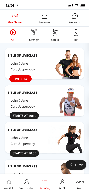
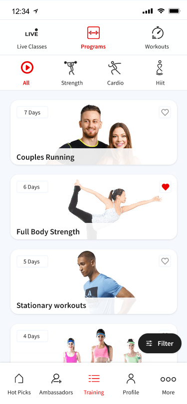
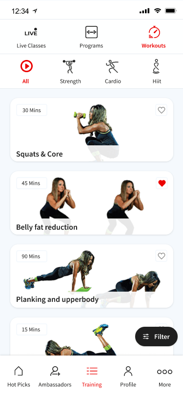
We agreed on general features such as starting with a focus on Live classes, Programs and Workout sessions and leave the leaderboards and achievements for the next major release.
I conducted several test session both in Iran and in Kuwait (Remote). I asked our focus groups to use their online fitness app of choice, mainly peloton, and tell me what they love or hate about it. Which features they wish it had and etc.
I was using “Human-centric test” observation method suggested by Donald A. Norman in The Design of everyday things book. Writing down their visceral, behavioral and reflective interactions and emotions.
Finally, we knew how we wanted to proceed with the business and it was time to start the Design Thinking Process and started to ideate for our feature and vision lists.
After multiple brainstorming, storyboarding, sketching, and doodling on notebooks, it was finally time to start wireframing the flows I had in mind. Initially, I created a very low fidelity wireframe with Adobe XD to present it to Kuwait. After a general agreement on the pages, I created a mid-fidelity Balsamiq mockup.
Testing the wireframes with fitness enthusiast test groups and our personas had a major impact on our flow. At first, I tried having a bottom nav-bar for different activities we had in mind (Live, program, workouts) but after trying it out, It didn’t feel right to have a tab-bar and a nav-bar stickied on top of each other. So I changed it to stick at the top of the page which in turn made our test group feel more natural while navigating between activities.
Sometimes trivial things such as how the content scrolls wouldn’t be that important at first. A/B testing the first mid-fi prototypes with horizontal and vertical scrolling for different content and button placements helped me understand in which positions (while doing the workouts) the user interacts with the app and our future iterations increased their engagement with our Class sessions by more than 35%.
Also another important factor was the “type/category” of classes which needed a tree-test card sorting to achieve the most universal agreed upon categories. This test and iteration decreased our User-errors down to 2% for category selections.
These were just two of multiple successful test iteration results which helped shape our app into what it would be.
One thing that came incredibly handy in this project was to always create a Design System artboard with all the assets in it as master components. It made my life much easier when doing revisions and trying new things. Component states and responsive sizes were a godsend from Adobe XD that made me switch from Invision Studio instantly.
As a team, we came up with an innovative idea to let the color palette, videos, images, icons, font family, and sizes be all uploaded to a cloud system we created called NCS. You could change anything from a GUI and it would apply the changes to all the installed apps without requiring an update. This way we could change bad-performing icons or app images instantly. I have to thank Payam Chamani & Hamidreza Vakilian for this robust & unique system.
It could be argued that the most important feature of our app was the video player. Most of the content’s endpoint was videos that would get played in rotation and had to be optimized to be able to get skipped, show what’s going on, and be not draw attention out of the main content.
I came up with multiple variations and kept building on the previous one until I finally reached one that I really liked.
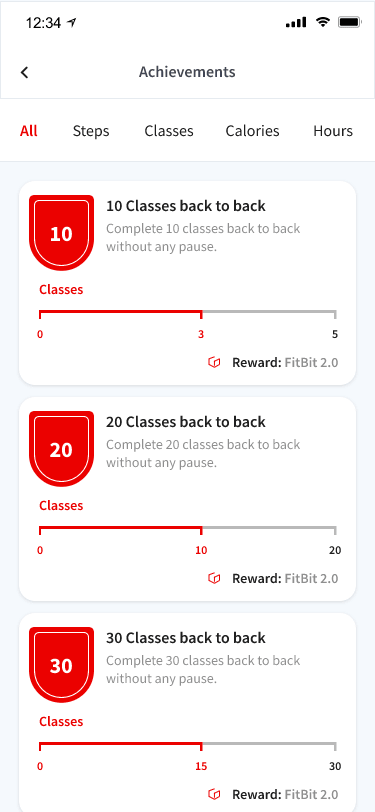
I thought finally, this is over but then, technical implementations crept over. We had a feature called “Achievements” which would track what you’re doing within the app and award you either digitally or physically based on how important that achievement was. Achievements such as videos watched, fitness mileage, fat burned and much more needed some kind of control device so a user wouldn’t be able to to just start playing workouts and leave the phone on 24-hours to amass points and cash out prizes. Fortunately we came up with a solution relatively quickly,
At the final stages of our design, I finalized our micro-interactions to give the app a lively and playful feel and take our app to the next level.
These animations and high-fidelity designs payed off when after a couple of month passed our launch date, Apple contacted us to feature us as the featured app of the day for the store.
You can view a couple of samples below.
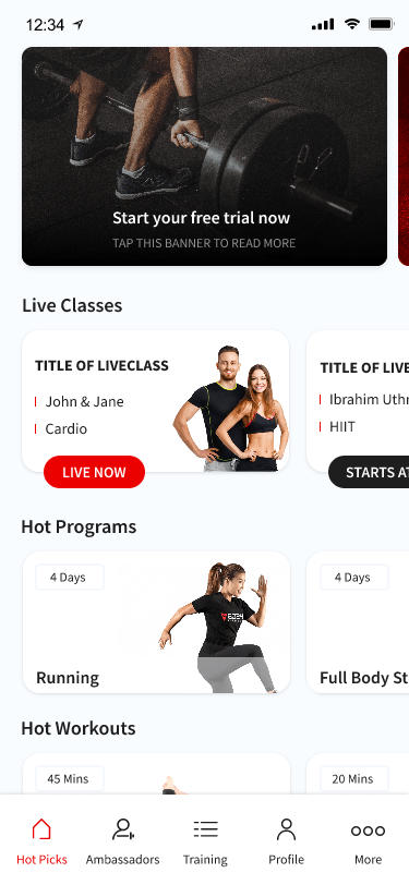
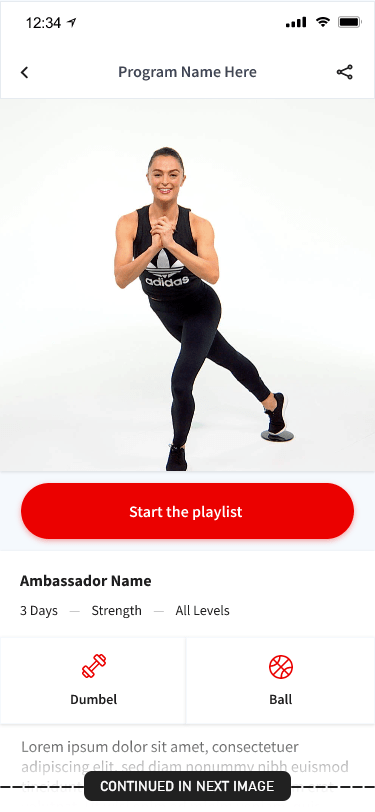
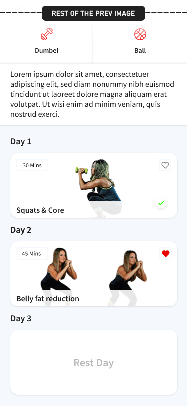
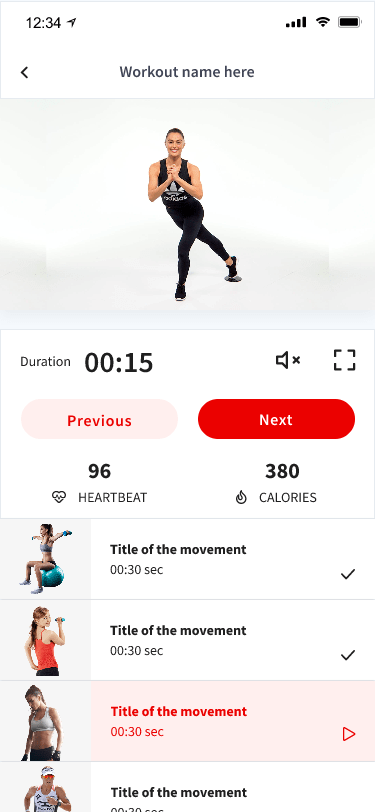
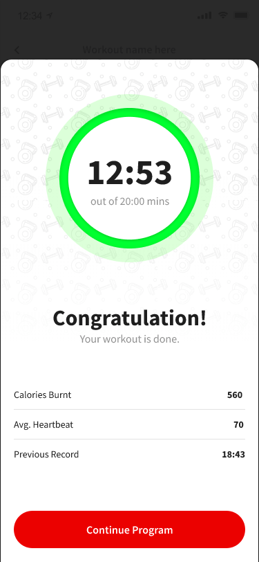
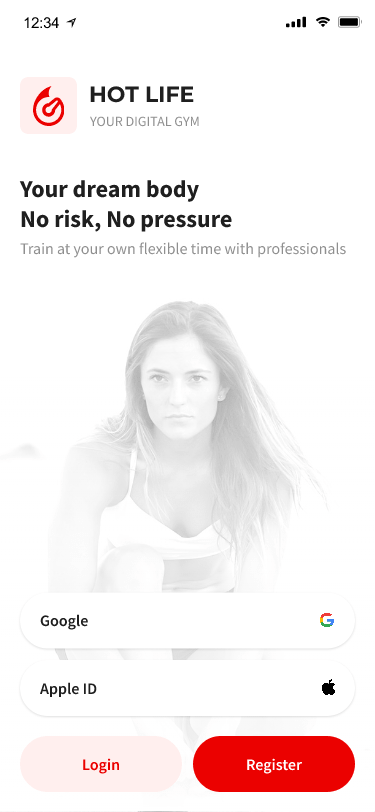
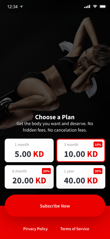
Main workout flow
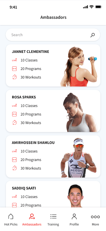
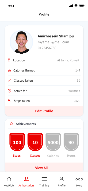
Supporting Pages
After starting with little to no information and then lots of workshops, user tests & just pure analytical guesswork we released the app and were overwhelmed by the response we got! After a couple of weeks we rocked our way to the top of the charts and have been constantly in the #1 or #2 top grossing apps in both IOS and Android markets. Up until the last days I was still working with the team, we were analyzing heatmaps, analytical datas and nps score to micro-adjust the apps into a better future. I’m glad I had the pleasure of working with this team and hope the best for the future of A Hot Life — Your Digital Gym
— Apple App Store
#1 or #2 Top Grossing Apps
— Google Play Store
#1 or #2 Top Grossing Apps