Dabdoob is a children toys and entertainment e-commerce platform designed to help parents find the perfect toy, birthday cake or venues for their children.
This very successful business aimed to redesign their application with extreme limitations and that’s when we came in.
☐ Redesign the entire application in 10 days
☐ Not changing anything that would need a backend update
☐ Very light workload on frontend engineers since the product should ship fast
☐ Add 2 features of “Birthday venues” & “Custom birthday cakes”
✓ Shipped the product in time
✓ Not only added the requested two features, Optimized the gift wrapping feature and cart too.
• Product Designer: Amirhossein Shamlou
• Android: Sadegh Saa’ati
• IOS: Hamidreza Vakilian, Mahan Mirshafa
• Backend: Payam Chamani
• Company: Nizek.com, Dabdoob.com
- Multi-country collaboration
This product’s base of operations and market is in the GCC area and Kuwait. As a team we had to collaborate with their office in Kuwait to create and ship the ideal product. - Extreme limitations on the design
No backend changes and a very short amount of time to ship the product needed out of the box thinking - Customer first approach
Even with the limitations, the product that was handed off made the client very happy and contracted us for a new product. Also with our optimizations their customers had a 2 point increase in NPS.
Our team’s goal was to redesign a previously existing app to make it look and feel better. On top of that we had to add 2 new features.
- Birthday venue booking
- Birthday cake ordering
Dabdoob’s original app’s backend was written in DotNet
In order to achieve a harmony with remote-agile environment a framework was needed. There were no previous design frameworks in place and we decided to use Design thinking over double diamond because of general familiarity with the team. This helped us integrate rapid lean UX/UI operations with scrum development in a small scale team.
One major push for the success of our product was to switch from task-oriented designs into goal-oriented ones. Examples below.
we revamped our referral system into a gamification program that has a wheel of chance rewarding you and your friend for each person you refer to our product.
Since then our referal program had a spike of about 50 referals per day for about a week. Then it went stable around ~6 per week. It is of note that the retention rate was less than 10% before the system was implemented.
The backbone of a bnb business is it’s hosts happiness and loyality. In order to increase our reservation approval rate by hosts I designed a “Leveling up” program which rewards hosts based on their “level” which increases by the number of their successful guest experiences, comments, monthly reservations, updates to their listings & …
On top of this program, there is a separate “Superhost” verified badge and search filter which awards hosts with exceptional ratings, approval rates, low cancellation rates and successful experiences.
All these combined, increased our reservation approval rates about 23% more than before.
Arguably one of the most important pages of our product is our listings/search results page. Previously they were sorted by default values such as price and newest. In order to help guests find better listings and experiences, I changed our default sorting algorithm to sort the results based on some weighted factors. These factors include but not limited to things such as a number of positive reviews, last updated time, price relative to same listings, amenities, description characters, room pictures & …
After A/B testing the old method with the new one, we found out the new method had faster time-to-book, better visit/request KPIs, and had an increase of up to 18% successful bookings per day impact.
Reviews are one of the most important decision factors for a guest. Same listings with one slightly higher rated than the other, skew requests towards themselves by more than 40% of the time even if the other one is a bit cheaper.
Our previous review system was a simple rank out-of-five stars for a couple of factors and asked if they recommended the place or not.
I redesigned the system to show emotion values for each star, adjust the rating factors to more useful ones (based on CX data), and added a “what I liked” and “disliked” section with predictive data studied from thousands of comments and assigned emotions to them.
In our recent testing sessions, we had around 6 out of 10 guests (compared to 3 out of 10 previously) leave a review for their experience and we were able to relieve some pain points of hosts’ concerns and help them improve their listing.
To create a cohesive and recognizable experience, I had to design a complete design system, adjust our color palettes and create a typescale and typography system to increase accessibility.
Creating this design system smoothed out our frontend operations a lot and helped to ship new features much faster than before.
The system helped shape our new desktop and mobile experience which you can view below:
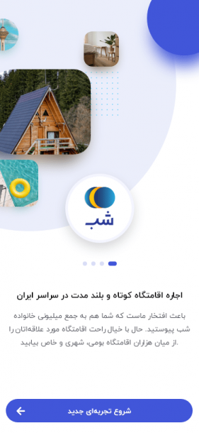
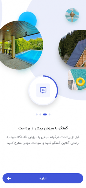
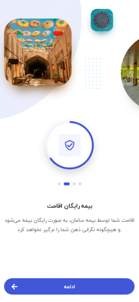
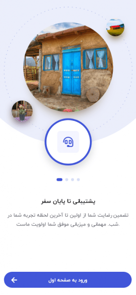
Onboarding
Homepage
Before
Extremely long scroll view (preview doesn’t even cover 1/4 of the full view) – repetitive categories being cut off and not prioritising their usefulness and bounce rate – Huge banners which take entire viewports without good CTAs – non native mobile design traditions and practices
After
Fitted the entire homepage with useful CTAs and banner in 3 scrolling viewports – familiar search box – Data-driven and predective search categories based on user behaviour – important CTAs shifted to better eye tracking positions – Added “Search near me” function – Shifted flash sales to the view port – bottom tab bar for easier navigation & usability
Search / Listings
Before (not the original old one – adjusted a bit to be modern)
Not using the search page to direct people into decisions – not promoting famous cities – no near location – hidden filters – messy map pins
After
Added famous cities and their typical usage to search suggestions – added a near me location – made famous filters much more visible – cleaned up the map to be much more precise
Listing Details
Before
Most important information are not at the top – amenities are not sorted by most useful and unique – host rules not very visible – too much bloated information and bad hotspots according to heatmaps
After
Reorganized information sections according to tests and heatmaps & eye tracking data – put much more focus into converting the user in the first 2 scrolls – made host rules much more easier to understand
My Trips
Before (Desktop – Old mobile screenshot not available)
Very different button designs in the same card – confusing touch spots – important information are not put into focus – confusing timeline flow
After (Desktop screen to compare with the old one)
Much more modern look – important information for trip put into focus – buttons are clear and organized – status made easy and added a timer
Invoice
Before
accessibility unfriendly – not focused on payment – not promoting free chat with host before payment – not showing rules and important info
After
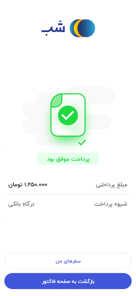
Added tabbed design with a focus on payment first – added information and rules tab – added chat wit host tab
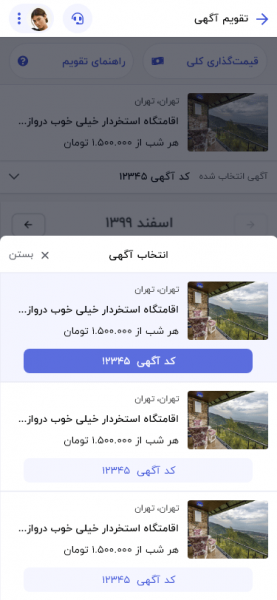
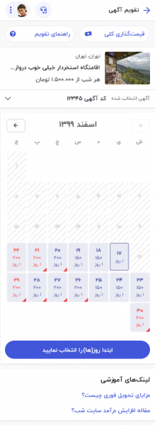
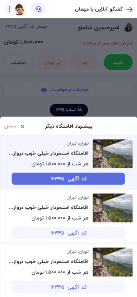
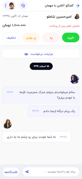
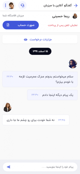
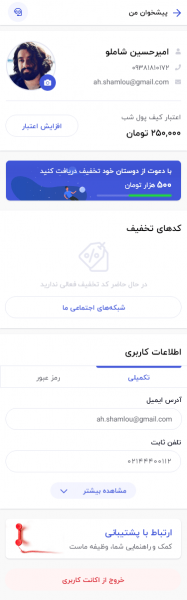
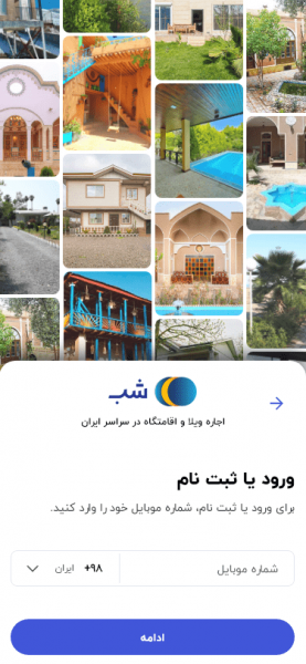
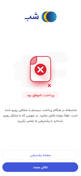
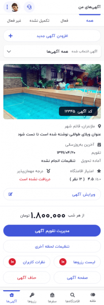
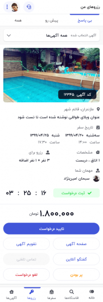
Other supporting pages

With huge thanks to our incredible team. We were able to increase our product value in every single aspect. Even with the people of Iran being in an extreme financial crisis and poverty, mandatory quarantine protocols which affects travel businesses a lot and as of yet still non-existant vaccination efforts. I’m proud to share the data below which includes a month after I joined the team up until now vs the previous period.
For our future, I’m excited to increase the products reach to include home-made foods, insurance packages and loyality clubs for both the hosts and guests, a “foursquare”
Ecommerce stats – My Period (New) vs Previous Period (Old)
Audience stats – My Period (New) vs Previous Period (Old)
Metabase KPIs – Previous Period (Old)
Metabase KPIs – My Period (New)